In the vast realm of web design, colors hold an incredible ability to captivate and communicate. They can evoke emotions, capture attention, and shape the overall impression of your website.
Understanding the art of color selection is crucial, and that’s where the Kadence Theme Color Palette comes into play.
With its carefully curated collection of accent colors, contrast or text colors, and base or background colors, this powerful tool opens up a world of possibilities for creating visually stunning and harmonious websites.
Imagine effortlessly highlighting important elements, guiding your visitors’ attention, and establishing a consistent design system with just a few clicks.
The Kadence Theme Color Palette empowers you to do just that, allowing you to elevate your website’s aesthetics and enhance your brand’s identity.
In this article, we will dive deep into the intricacies of this palette, learn how to access and adjust its colors, and even explore methods to generate the perfect color combinations for your website.
So, whether you’re a seasoned web designer seeking to fine-tune your color scheme or a novice venturing into the enchanting world of web development, get ready to unlock the true potential of colors with the Kadence Theme Color Palette.
Let’s embark on this journey together and discover the art of color harmony that will leave your visitors spellbound and craving for more.
Understanding Kadence Theme Color Palette
The Kadence Theme Color Palette is designed to help you maintain a consistent design system throughout your website. It consists of three types of colors: accent colors, contrast or text colors, and base or background colors.
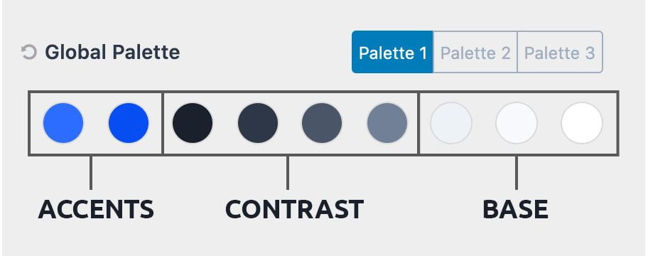
Accent Colors: These colors are attention-grabbers and are used to highlight important elements on your site, such as calls to action and powerful one-liners. It is recommended to spend time selecting the accent color as it sets the rhythm for your brand.
You can also choose an alternative accent color that complements the main accent color or a darker/lighter shade of the accent color (Check the Kadence Theme documentaion).
Contrast (Text) Colors: These colors are used to create a design hierarchy with your text, borders, and other elements. They are usually darker “gray” colors that determine the text color for headings and main site text.
Using off-grays, such as cool or warm grays, can give your site a richer look. The choice of cool or warm grays depends on your accent colors.
Base (Background) Colors: These colors are usually light, with white being the lightest. There are two off-white variations that provide enough contrast to show a visual difference without making the text difficult to read.
The base color is the color that people notice the least, but it plays a crucial role in bringing all the other colors together.
By setting these colors and using them throughout your site, you can maintain a consistent design system and easily make adjustments later on.
Accessing the Kadence Theme Color Palette
To access and adjust the Kadence Theme Color Palette, follow these steps:
- Go to your site’s admin dashboard.
- Navigate to Appearance > Customize > Colors & Fonts > Colors.
- In the customizer, you will find the nine colors that make up the Kadence Theme Color Palette.

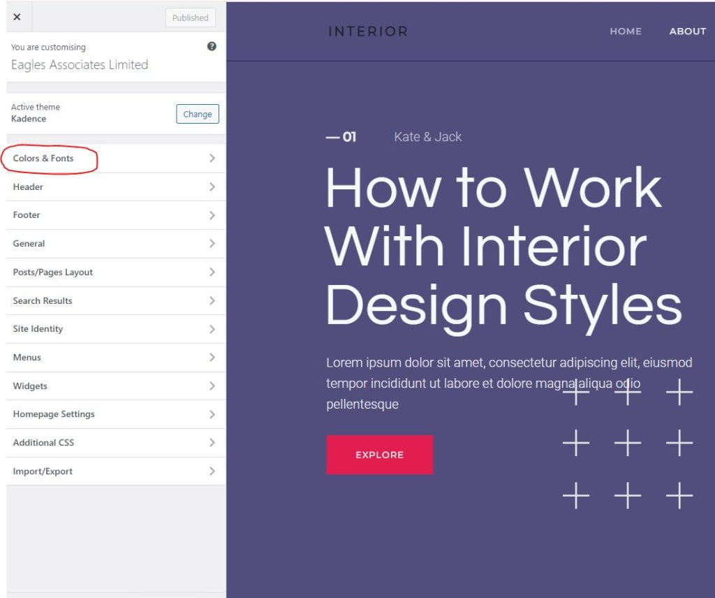
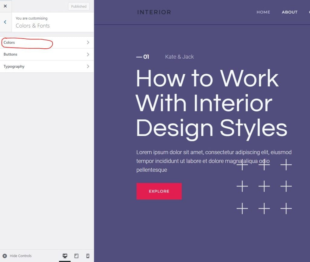
You can switch between different palettes in the customizer, but it is generally recommended to keep the same pattern that you see when you first load the theme
It’s worth noting that the Kadence Blocks Colors feature allows you to add additional colors to your palette, which can be easily accessed in the block editor.
Creating a Color Palette in Kadence Theme Color Palette
The Kadence Theme Color Palette offers a range of customization options to help you create a unique and visually appealing color scheme for your website. Follow these detailed steps to customize your color palette:
Step 1: Navigate to the Color Palette Once inside the customizer, locate the “Color Palette” as shown in the section above.
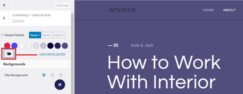
Step 2: Choose or Add Colors to the Palette In the Color Palette settings, you will see various color options ordered from “Accent Colors,” “Contrast or Text Colors,” and “Base or Background Colors.”
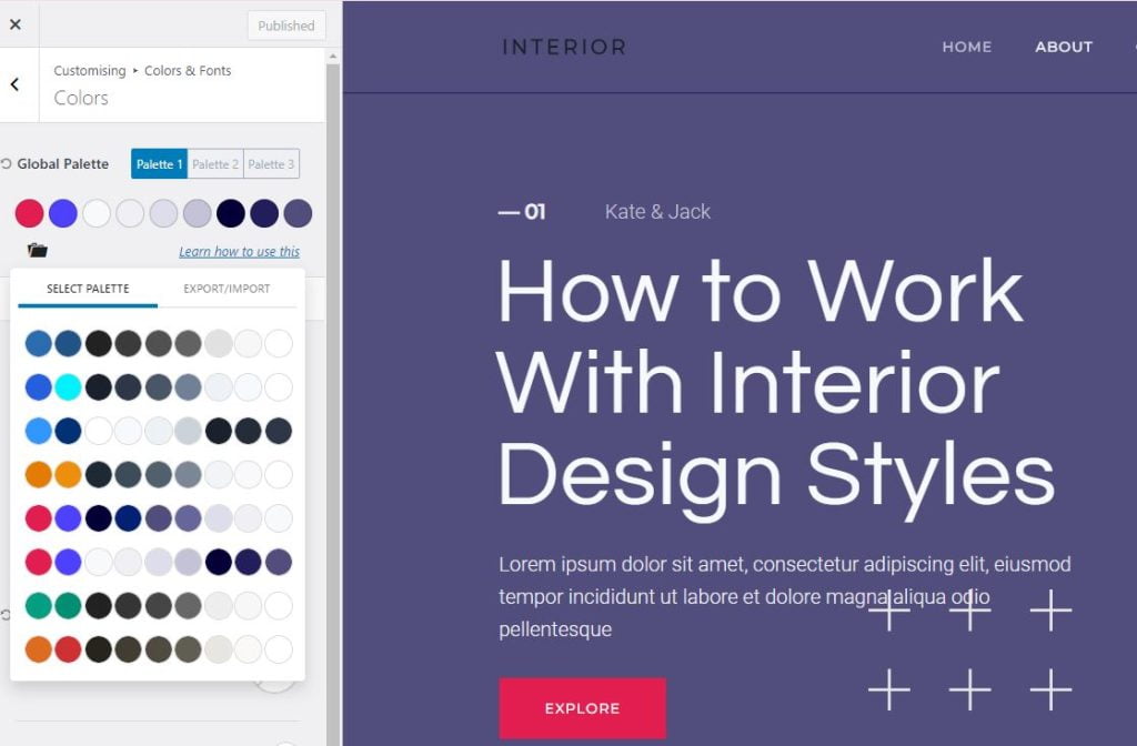
The colors are not labeled. However, from the first section of this article, we know that the first two are accent colors, the next four colors are contrast colors and the last three colors are base colors.
You can choose any of the preset colors and apply them to your website. You can also try many different colors.
Step 3: Customize the Colors After adding a color palette, your site will be set with uniform colors which will be applied to your entire site.
If you can’t find a color palette that suits your brand or that match your desired aesthetic, you can create a totally new palette by editing already existing colors in a color palette.
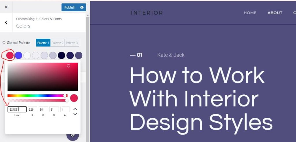
In order to edit your colors in the Kadence Theme Color Palette, adjust the hue, saturation, and brightness sliders, or manually enter the color’s HEX value. As you make changes, you’ll see an instant preview of how the color will look on your website.
Step 4: Save and Apply Once you are satisfied with your color choices, click on the “Publish” button to save your changes and apply the new color palette to your website. Refresh your website to see the updated colors in action.
With the Kadence Theme Color Palette’s comprehensive customization options, you have the power to create a color palette that perfectly aligns with your website’s branding and design goals.
Let your creativity shine and transform your website into a visually stunning masterpiece.
How to Generate Colors for Your Website
If you’re looking for color inspiration and color combinations for your website, you can use Canva Colors. Canva Colors provides various color tools and resources for web development projects.
One method is to choose from pre-made color palettes with your desired color combinations. Here’s how:
Method one: Pre-made color palettes
One method is to choose from pre-made color palettes with your desired color combinations. Here’s how:
Step one: Go to the Canva color palette generator.
Step two: Scroll halfway to find color palette ideas.
Step three: Click on “Explore color combinations” to see different combinations.
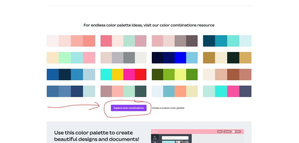
Step four: Choose a color combination or search by typing your color in the search bar. In the search bar, type the name of your desired color and choose the best combination.
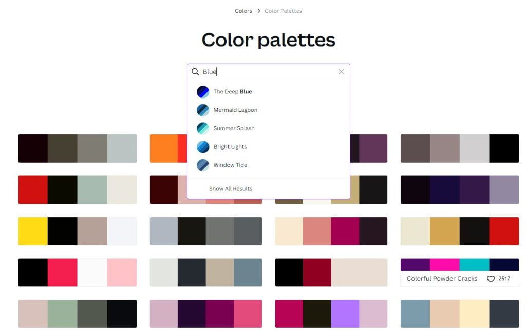
Hover over the color combination to see the name of the color and its combinations.
Step five: Click on any of the colors in the main combination to see more possible combinations for that color. This will lead you to the next page where you will see the name of the color and its combinations, including related combinations.
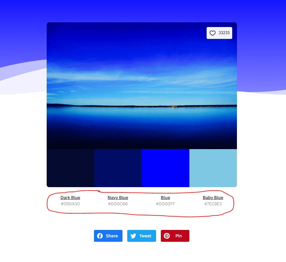
Click on the name of the color and not on the color itself. Clicking on the color will make you copy the color code.
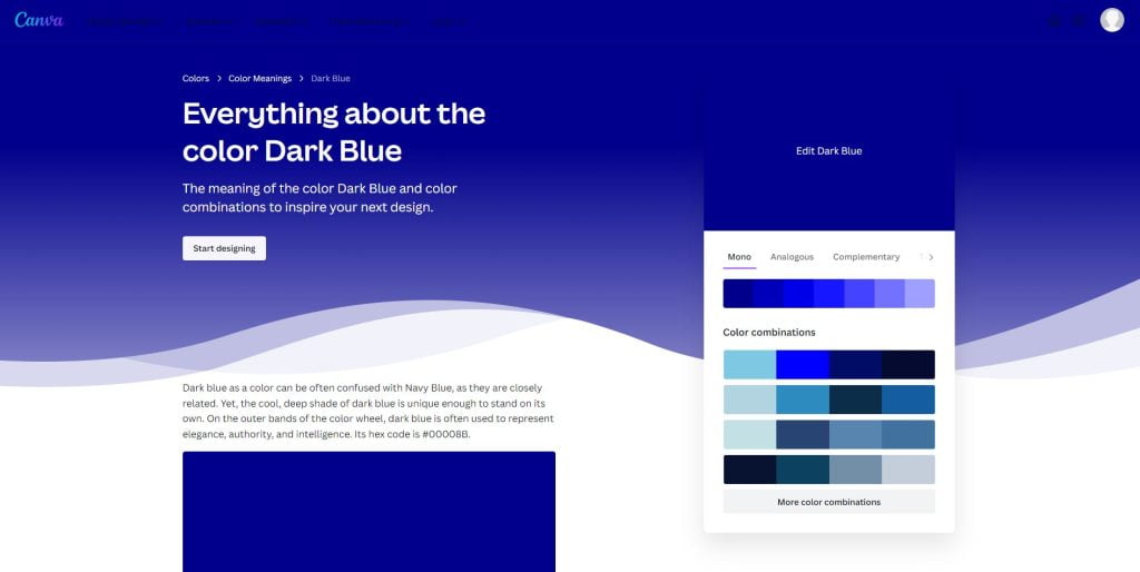
You can choose between mono colors and complementary colors. Learn more about colors types here. After you are satisfied with the colors, copy the color codes to the Kadence Theme Color Palette.
Step seven: Copy the color codes of the selected colors to the Kadence Theme Color Palette.
Method two: Using the Canva Color Wheel
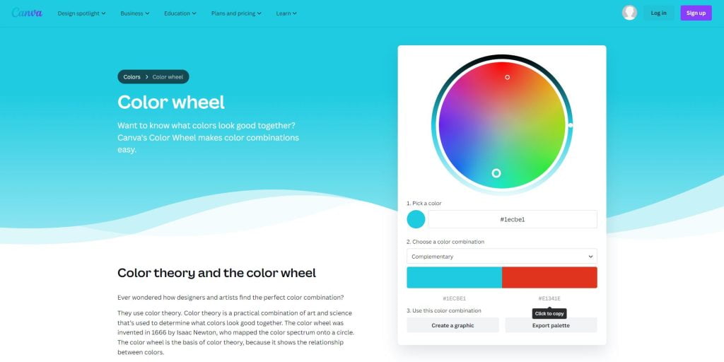
Another method is to use the Canva Color Wheel, which helps you determine what colors look good together based on color theory.
Understand that the Kadence Theme Color Palette consists of accent colors, contrast colors, and background colors.
Accent Colors
For accent colors, consider using complementary or monochromatic colors.
Complementary colors are on opposite sides of the color wheel and provide high contrast and impact.
Monochromatic colors are shades, tones, and tints of one base color and provide a subtle and conservative combination.
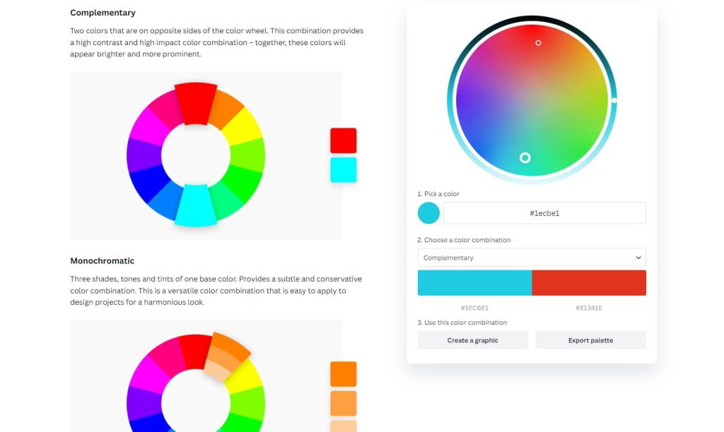
Base and Contrast Colors
For contrast and background colors, consider using tetradic and triadic colors from the Canva color wheel, respectively. Tetradic colors are evenly spaced on the color wheel and work best when they come from the same color family. Triadic colors are evenly spaced and provide a high contrast color scheme.
Adjust the hue, saturation, and luminance of the colors to suit your website’s branding. Hue refers to any color on the color wheel, saturation refers to the intensity or purity of the color, and luminance refers to the brightness or lightness of a color.
You can adjust these elements by clicking on the color and making the necessary adjustments
Conclusion
By using the Kadence Theme Color Palette effectively and generating colors for your website, you can create a visually appealing and cohesive design system.
Remember to keep your color palette simple and aim for three core colors or color categories.
For more information and tutorials on using the Kadence Theme Color Palette, you can refer to the Kadence WP documentation and the Kadence Themes website.
I hope this information helps you in using the Kadence Theme Color Palette effectively and generating colors for your website. Let me know if you have any further questions!


